Category Archives: Usability

Why waste such a valuable space?

I hate complaining.

Wait, that’s a lie; in fact I actually like complaining. I like looking at a problem or some sort of sub-optimal condition and say, if you just changed that bit, if you just dropped that thingummy, it would be so much easier for the people who come into contact with it. I make a living from telling people what is’t optimal in their product, service, website and then offer suggestions based on research, information from users, and solutions other people have come up with. I’m a bit like an iron, smoothing out the wrinkles of experience. *groan*

So, you might say, complaining is my job. Yes, I like complaining. I spent 15 minutes on the phone with Apple yesterday whinging about how even though it let me type spaces in my password, didn’t flag it was an issue in the error checking, and accepted my entry; it still failed my login attempts because my pass had spaces which they didn’t record. I’ve never met a coder who hadn’t read the XKCD Password Strength comic so there’s no excuse for not testing predictable use cases. Really.

But this post isn’t about Apple, it’s about a different music service.

Continue reading

Beautiful simple solutions

I was getting frustrated, as were others, about the Mac OSX default column width in column view.

Yes, you could handily double-click the column handle and it would expand that column to the width of the longest file name (you knew that one right?), but I often have to use long filenames.

So I recently decided to change the default column width, opened Terminal and steeled myself to having to hack some core setting with some command-line arcane incantations. After a search of a few seconds I came across this video from Jason Glaspey

Change default column widths in Finder (Mac OSX) from Jason Glaspey on Vimeo.

What I love about this control of the interface is that I could have discovered it by accident but it was also put there on purpose, by an interface designer who thought about (or paid attention to user testing about) the sorts of thing a user might want to modify globally. In addition, the change is shown in real time, across all windows, communicating very simply and elegantly, the results of the change to the user, immediately, without text or technical explanations.

That is what good design, and good user experience is about.

test for failure, not success

I’m visiting Toronto at the moment and had an experience with a boutique hotel and their website.

As you can see, their room request form is wonderfully simple and usable in design.
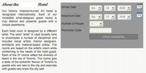
Availability request form

It was easy to use, clear and offered just the right amount of options to get the request in. Very pleasing. I’m willing to forgive the copy being sub-standard since the form is so straightforward and is exactly what I need from a booking request.

Unfortunately the message that followed was less than useful.
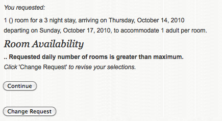
Lack of availability at the Gladstone Hotel

in text:

You requested:
1 () room for a 3 night stay, arriving on Thursday, October 14, 2010, departing on Sunday, October 17, 2010, to accommodate 1 adult per room.
Room Availability
.. Requested daily number of rooms is greater than maximum.
Click ‘Change Request’ to revise your selections.

I’m not sure what they think I might conceivably derive from this response, but what I actually did was book a room in another hotel down the road, where I could get the sort of room I wanted and the booking was straightforward, and more importantly, successful. I contacted the hotel to let them know of the error, trying to be helpful and the response I received was that the site was not “broken”. I was told the error arose because there were no vacancies on Oct 14. They did not explain why the error message did not say this. They did not try to discover where I experienced a problem, but to their credit, asked several questions to attempt to find me a room, albeit 2 days later.

.. Requested daily number of rooms is greater than maximum.

This clearly is a statement that was never tested with users, for I cannot imagine a test user understanding what went wrong here. Not only was the information supplied unhelpful, clicking either button (Change Request or Continue) produced an application error (Error:500) and stopped me in my tracks. There was no further progress possible. You should attempt to never deliver an application error to your customers and this article from Smashing Magazine might help give you inspiration on what types of response you can give. It shows 404 errors (page not found) but with some clever coding, you could also use it for application errors, like Twitter does when their servers are feeling a bit stressed, causing them to deliver the Fail Whale page. In fact, the Fail Whale is so popular it has it’s own fan club. You should be so lucky with an error page!

This to me was an obvious example of where user testing would come in handy, in particular, testing what happens in the system when someone tries information that produces an error or is outside of expected inputs. If I had changed my dates (not possible in this example) I may have received a better response from the site, perhaps.

It appears to me they spent little if any time working out what would happen if something went wrong and the system needed to deliver an error message. They also didn’t spend any time testing what messages would be delivered to users under different, normal circumstances, like when a room is not available for a desired date.

A valuable lesson is that when planning, building and testing, you need to make sure your communications are succinct and clear, and to test that your error messages make sense to they types of users who come to your site. In addition, you need to prepare for when things go wrong, when people break the bounds of expected or calculated behaviour, and not just when they make choices you are prepared for.

How much business or attention are you losing by not having thought of the errors deeply enough?

User experience in a nutshell

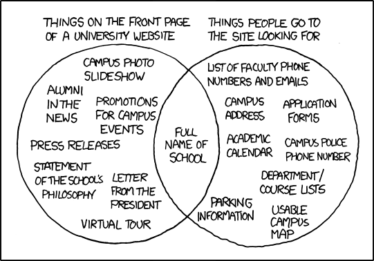
User experience in a nutshell, thanks to the always interesting XKCD:

university website Venn diagram

While I was at UX Australia last month I saw a load of venn diagrams, many of them useful as a conversation-starter, to focus on the subject, but to me they ended up mostly saying: “this bit in the middle is what I want to talk about”. My problem with venn diagrams is they can be created without meaning or value and  are indicative only of one’s intentions, one’s desires, one’s own perspective, not a truly factual or researched mapping.

But I like this cartoon as it describes almost every initial meeting or workshop moment I have experienced with a client in the past.

Very often the problem with a User Experience exercise is that the client wants what is on the left and the user wants what is on the right and for some reason, the left often wins. I completely understand why they find the left important and the right scary, but isn’t “a little scared” where you need your clients to be, in order to push forward with improvements, or truly deliver on their real business goals?

Very often the information on the right is readily to hand  but they fear it is problematic or scary to release all of it or to set up the workflow and administration for it to happen. But they’ve come to you to deliver a solution to their problems, and it may be that the way to do it is to ignore their “delivery” problems and solve their user’s problems first.

You should always “scare” your clients, just a little bit, and definitely within their tolerance, but scare them a little. They’ll often understand it if you make it easy for them to do so.

PayPal Developer Day

I went to the PayPay Developer Day at The Grace Hotel yesterday, which was described as the launch of  a community for PayPal developers in Australia, the first country outside the US (and Canada?) to participate.  I’ve since noticed the UK in there as well. Since they rightly recognised that developers are their front line and are often the people who scope and recommend a payment processing option, they want to both support and influence their decisions.

Unfortunately it was more of a marketing than developer event, with not enough real world examples and more of a lecture-based set of presentations. As one dev put it, he could have happily followed a few links to play with new features in the API in his own time, as he gained nothing extra from the half-day session away from his computer(s). Devs don’t “look” at code as much as some people think; they look at code as much as cooks “read” recipes. They want to bite into code and try the new ingredients in their own kitchens and with their own pots, pans and spices, and their ideas for flavour combinations. They are very much hands-on people.

But for those with their planning or implementation hats on it was a great day. If you need your payment process channel to do more, and you like the types of tools and features PayPal offers, then selling it as the solution has become much easier. The devs are well supported, both with a local developer centre for all the devs who pass the PayPal Certified Developer exam, as well as a sandbox to test out your installed APIs and mods.

I was a bit worried that it ended earlier than scheduled, so maybe they trimmed out too much from what they thought would fill the day, but I had a great talk with a few of their reps. Seems like The Australian office is pushing the US office for more agility and improvement on the User interface, which looks like it was designed by coders from the 90’s and has no design considerations at all. And it looks like the locals here will get to influence what happens in code much more, by being vocally involved in the dev centre. And to top it off, they were giving out free exams to the first 150 through the event, a saving of $300 (three exams, $100 each).

If you use paypay on your site(s) or are a developer or Project Manager considering a payment gateway or agent, the new tools available, and the certification process presented by paypal will definitely get you closer to a better pay experience.

A taste of something better

After my rant last week about restaurant sites that don’t take users into account, just like London busses, three good ones come along at once! I didn’t want to leave you thinking I was all whinge and no praise so decided to write about them here.

We were looking for a good Indian food or African food delivery in the neighbourhood and did the searching in my usual way; online.

The first happy discovery was the African Feeling restaurant,which surprised me because, for such a modest and unassuming place, it felt like a very well thought out and professional site. Not perfect, but well ahead of the more expensive and hip competition, I must say. It has room for improvement, but is a very good effort and answers the visitors questions.

Location, menu examples and prices and atmosphere images were easy to find, even if not optimally formatted (menu was a JPEG, not in searchable and SEO friendly text). Nice touches were the great portraits of staff, food, dining room and examples of how a dinner party might look. You can even book a table through the site and get an email confirmation.

My favourite though was the honesty and confidence of linking directly to published food reviews, from notable publications like the SMH, as well as including user reviews.

Nice touch!

But they didn’t deliver, we felt lazy that night, so shelved it for a dinner plan later in the month.

The next one had a name I didn’t like but understood the reasoning for. I was led to Posh Spice through the positive reviews but stayed because of the menu and ordering system which, quite clearly, had been thought about and tested by the providers, Menu Log.

The delivery prices were the same as the restaurant prices, not more than, which is what some third party delivery services charge. The entire process thought about retaining my trust, from the AJAX shopping cart system, through to the email and SMS confirmations and 15% first order discount.

Interestingly, it created confidence in both the restaurant as well as the delivery ordering experience,. difficult to do in one hit.

What pleased me was the recognition of how to speak to people in an online environment, and how to cater to letting them discover their needs. Posh Spice, with their partner MenuLog,. clearly want to help you make your decision eaily.

Oh, and yes, the food was most excellent, (I reccommend the fish with coconut and the “osso-bucco” style lamb shank!) delivered with a smile.

Style over substance

Let’s cut to the chase!

Who is advising restaurants, bars and clubs that what their visitors want is a Flash(tm) animated brochure?

When I look up a bar, restaurant or club / music venue, I’m usually after a few basic slices of information, like where it is located, what the food is like or what’s on tonight or this weekend. Of course there is a lot more you’d want to know about  a venue, but these are what I would think are core pieces of information many people would be wanting from a venue’s website. Unfortunately many venues have been advised by their “web people” to publish a set of slick, glossy pictures of the venue, in a Flash slideshow/animation sequence, utilising Flash navigation, and not a great deal more.

Can anyone explain to me why these bars, restaurants and clubs don’t bother looking at what visitors want from websites and help these same prospective clients find it on their websites? Is it really in a venue’s interest to hide the location map somewhere unexpected or provide their menu as a downloadable PDF? And music venues and dance clubs: Thanks for the pictures of the pretty people who cone to your place, specially the hot babes! but since I came to your site to find out more about a night out at your venue from a flyer someone handed me, can you provide more information besides re-presenting the flyer I already have a copy of? Or did you think the babes were enough? hmm, I thought so.

Can you not tell me about the artists who will be playing, DJing there, any reviews of past gigs, what the drinks cost, whether you also have snacks, what time the club closes, when it’s not available due to a “private party” and any other thing that would make me interested in coming to your venue, instead of what YOU want to tell me?

Have you a Facebook group? A mySpace page? A twitter stream? If so, can you tie them together so I can find the others through any one of them?

If not, can you spare a couple hours a week to connect with your people out there? There’s plenty of excelent on-line tools and APIs to help you do this.

Oh, and if you want to be found through popular searches, just make sure there is something serachable and index-able on your site.

… just sayin!

Crossing the road

I’ve been watching you.
I mean, I like watching you.
I mean, you’re interesting to watch.

I’m digging myself a hole, aren’t I?

I like to watch people using technology in a public place, to see how considered their planning might have been, just like I like to watch people use websites, to learn how to make websites better.

Since coming to Sydney, I’ve been watching how the crossing signals and crossing buttons are used here, as Sydneysiders are a bit different to Londoners and Canadians with this.

At crossings here, there are assistive technologies with big obvious buttons, audio and sensory feedback (the crossing buttons make noises as well as vibrate in an obvious way) to let pedestrians know what’s happening. What I love is watching people use the big button.

There’s nothing simpler than a one button device is there?

My favourite users are the ones who hit the buttons VERY hard, as if it were their worst enemy, or repeatedly, as if several hits make it react more quickly.

The problem with one button devices is that we think of them like light switches; click should be on, end of story. Even when we know different, because we know the traffic lights will not change at our whim, we still treat it like a light switch.

So even a one button device, controlling something we’ve known well since childhood can throw up some surprises. Think of how many surprises your website can uncover.

Like I said, I’m watching you.

CPOTD (Commuter Pic Of The Day)

subtitled: shitty clouds, that’s why I left London innit?