I love IKEA!
That’s a big thing to say after blogging nothing for a few months. In particular since it has nothing to do with the www, at least at first glance. But it does, in a way, because, in my mind, almost everything has to do with the internet. It does have to do with understanding your customers though. Bear with me, friends.
For those of you who know me, you know I have moved from the UK to Australia over these past few months. Winding up work, packing up the flat, shipping it all out to Sydney, saying goodbye to loving friends, taking a well earned month off in Fiji in a hut with no electricity, (I know, hard work!) then landing in Newtown, settling into the house, buying furniture, getting listed and documented by various government agencies, sorting out broadband, telephone, finding interesting companies to approach for work, etc…..
*whew!* busy! but fun. So not much time for blogging, although I’ve been pretty busy in the Twittersphere and various IM tools like Skype and GTalk with friends and family from across the world, fun but busy.
So what’s this about IKEA? Right; IKEA gets me right. IKEA knows me and gets it right. No only me but many other people right too. They know enough of us to get most of us right. I’ve been supremely impressed by the amount and quality of information they can fit into their assembly diagrams without writing a single word. just pictures and numbers. For IKEA experts like myself, *blush* the information is straightforward and simple. For flat-pack newbies, it starts by telling you you can do it yourself, telephone them for help or have them walk you through assembly in the shop. It tells you what should be in the box, what tools you need and what skills you should posess. At the beginning of the document, where you need to see it. At every point in the assembly process where it gets a bit tricky, the information is more detailed and methodical; where there’s easy repetitive information, it all fits in one diagram. In some ways an IKEA instruction booklet not only tells you how to assemble this particular item but it tells you how to approach all flat-pack-furniture tasks. Brilliant!
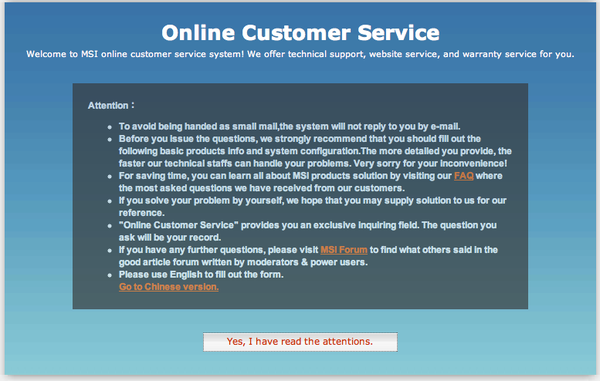
This was a very different experience to this message from the MSI website where I simply wanted to report a fault:

Here’s the text to help you read it better:
========
Attention:
- To avoid being handed as small mail,the system will not reply to you by e-mail.
- Before you issue the questions, we strongly recommend that you should fill out the following basic products info and system configuration.The more detailed you provide, the faster our technical staffs can handle your problems. Very sorry for your inconvenience!
- For saving time, you can learn all about MSI products solution by visiting our FAQ where the most asked questions we have received from our customers.
- If you solve your problem by yourself, we hope that you may supply solution to us for our reference.
- “Online Customer Service” provides you an exclusive inquiring field. The question you ask will be your record.
- If you have any further questions, please visit MSI Forum to find what others said in the good article forum written by moderators & power users.
- Please use English to fill out the form.
Go to Chinese version.
========
There are so many instances of wrong in this I can hardly contain myself but a few pop out to me right away. It is not intelligible English, for a start, and it would have cost little to commission even an expensive copywriter. I particularly like how it asks you to return to the site (URL please?) and supply the solution should you find one yourself, before you have even asked them for help. It is a lot of confusing information that is mostly unnecessary. I seriously though of returning the computer as DOA and getting a refund. In fact a lot of the reviews for this otherwise excellent computer came with a warning about bad service ,already scaring some away from this particular product. I won’t go into the farcical details of the quality of further communications or how I finally fixed it myself just before they offered to have it returned for “repair” without offering some simple solutions first.
So why do so many companies take the MSI route over the IKEA route? Why do so many companies make it difficult to love their products and why do so many of them completely forget that happy people come back and the pissed off make sure they don’t?
This is what User-Centred Design (applies to a call centre or customer service website as much as a car, computer or kettle) is all about; what is the user experiencing and how can we make it a positive experience for them while making sure they part with their money with us for their next purchase?
Everyone I talk to hates visiting IKEA, they hate the maze, the massiveness, the shelves, the meatballs, the outlying distant-ness, yet it is highly successful and 4 out of 5 people go back again within 2 years for more. So they must be getting something right and I think it is the small things that bring people back, like the helpful instructions and useful website that do it.
Charles Bukowski once wrote a short story about the little things that drive people mad. Not the world wars or huge calamities, but the little things like broken shoelaces and loose handles and static-plagued telephone lines. I think it is the little things that keep people coming to you, like friendly staff, helpful instructions and looking at it from your point of view.
Don’t drive your clients mad, help them love you.


